
Good energy.
Great first impressions.
A local electrical company with a personality worth showing. A website designed to make that personality impossible to miss.
Not another
generic contractor site.
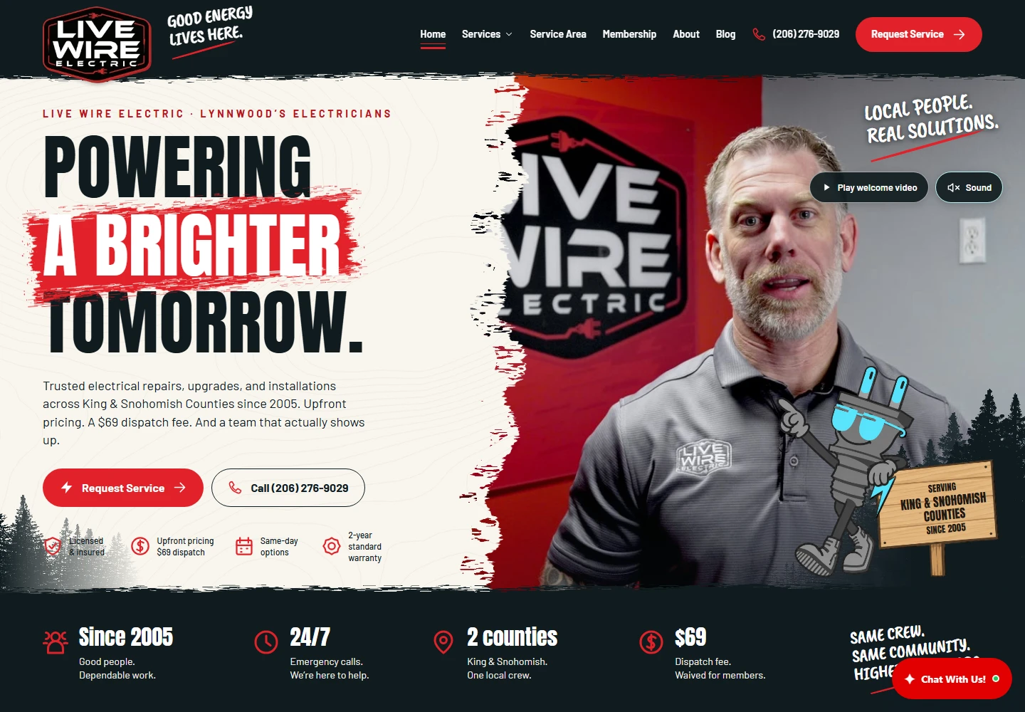
Live Wire Electric needed a digital presence with the same recognizable character as its brand. The website brings bold electrical-service messaging, a local welcome, and practical customer journeys together in one coherent design.
This showcase looks at the live experience: the brand system, service architecture, community directory, and the way the layout adapts to a smaller screen. It is a design and implementation case study, not a claim of measured ranking or revenue improvements.
A brand you can
recognize in a second.
The homepage pairs oversized condensed typography with a red brushstroke accent, warm off-white surfaces and dark ink navigation. Regional tree silhouettes and the Sparky mascot make the visual language feel specific to Live Wire rather than interchangeable with another contractor.
A prominent welcome video puts a person at the center of the experience. The service message stays beside it, with direct service-request and telephone actions rather than an abstract statement about innovation.
From “what I need”
to “what I do next.”
The service hub organizes electrical work into recognizable groups: repair, panels and power, lighting and fans, EV charging, backup power, and wiring and safety. Visitors can begin with a problem or a project, then follow a more specific service link.
Phone and service-request actions remain part of the journey. Membership, company information, FAQs and project guidance provide useful context before an inquiry. The service-request destination connects to TradeVulcan; a request is not represented as a confirmed appointment.
Explore the services hub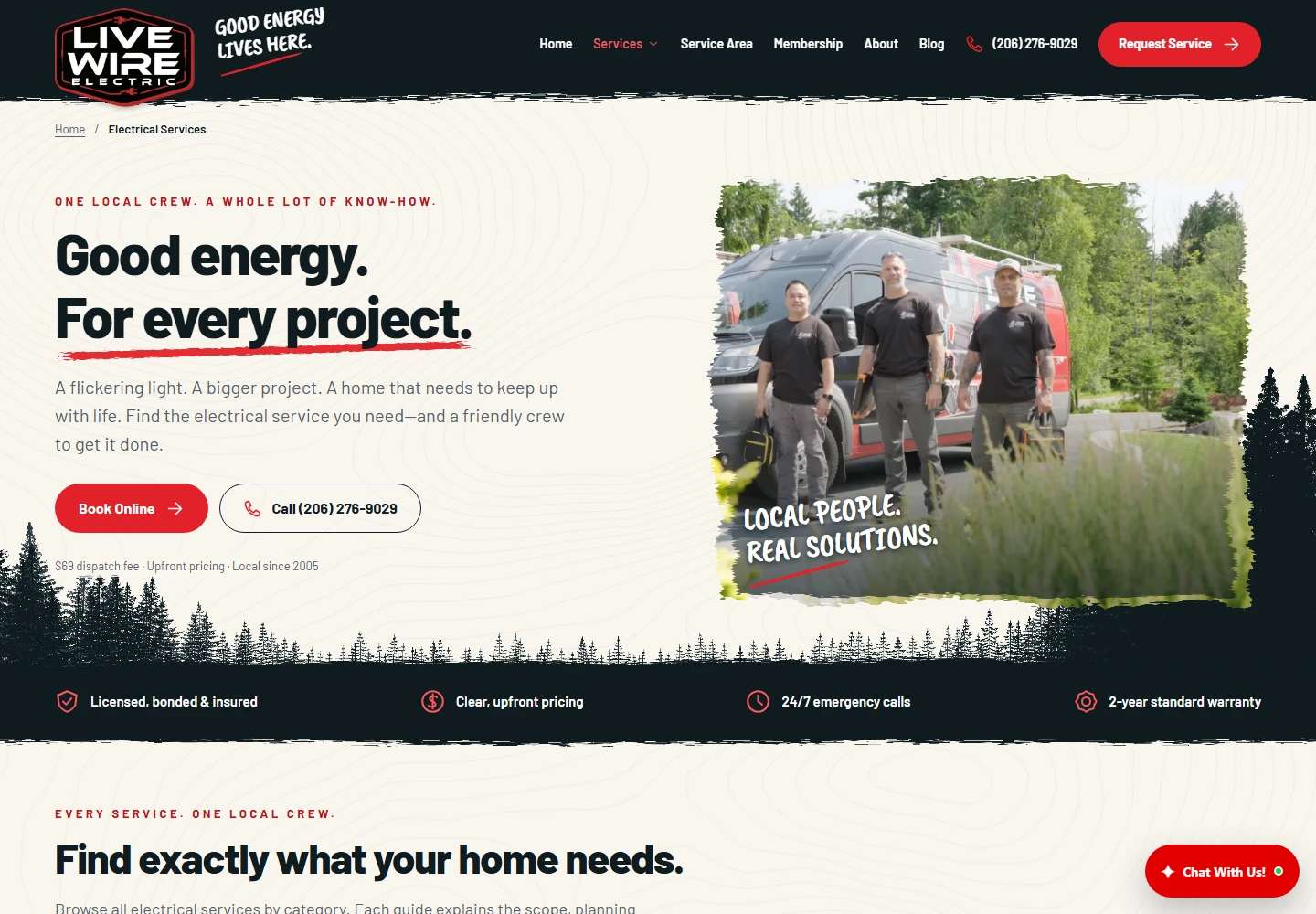
Local relevance.
With a useful structure.
Live Wire connects its service offering to the places it serves through a searchable directory listing 72 communities. The service-area page links visitors to individual community pages and keeps address confirmation close to the decision.
Service and location hubs create clear internal paths instead of leaving visitors to navigate a flat list of unrelated pages. Descriptive page titles, visible headings and focused copy help explain what each page is about.
The search story here is the foundation: useful content, deliberate links, and local context. Search visibility still depends on indexing, competition, reputation and ongoing content quality. No ranking, traffic or lead increase is attributed to this design review.
Explore the community directory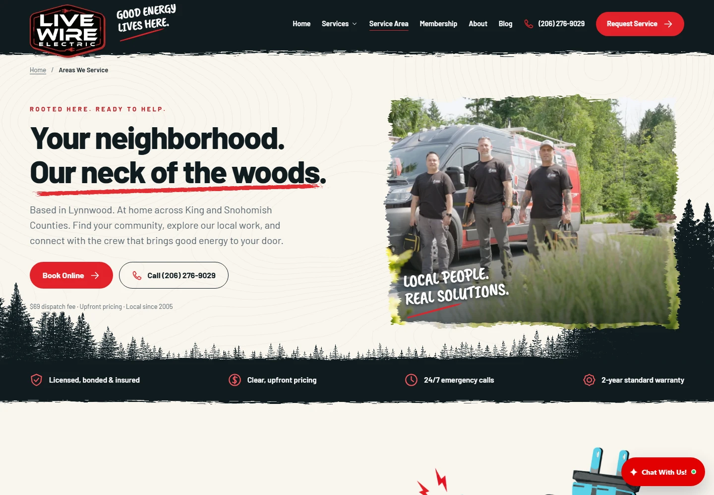
The same brand.
A different canvas.
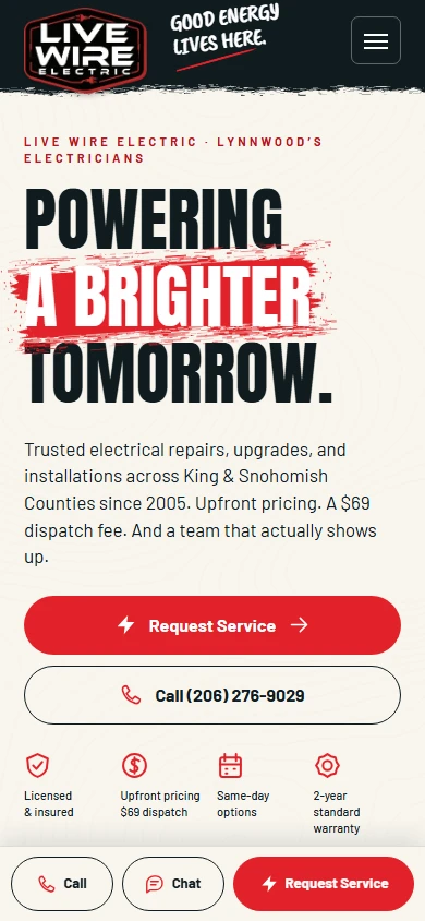
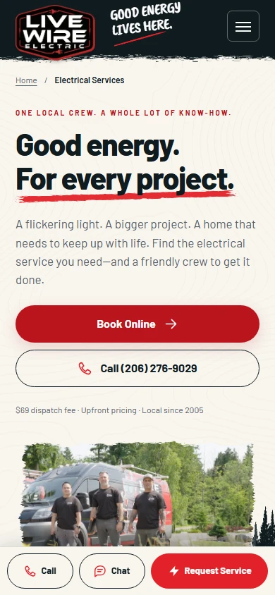
The mobile experience is not a shrunken desktop screenshot. Navigation condenses, the hero becomes a vertical story, and touch-friendly service and phone actions keep the next step accessible.
The captures alongside this section are taken from the live site at a 390-pixel viewport. They show the actual mobile homepage and service hub, rather than a generated phone mockup.
The details belong
to the same story.
A recognizable company
The typography, color, people and regional details reinforce one identity.
A purposeful page structure
Service hubs and community links help visitors move from broad intent to relevant information.
A clear next step
Calls, service requests and helpful supporting pages stay connected to the content.